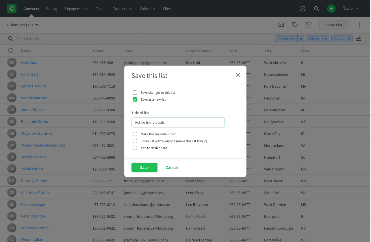
Contact list redesign.
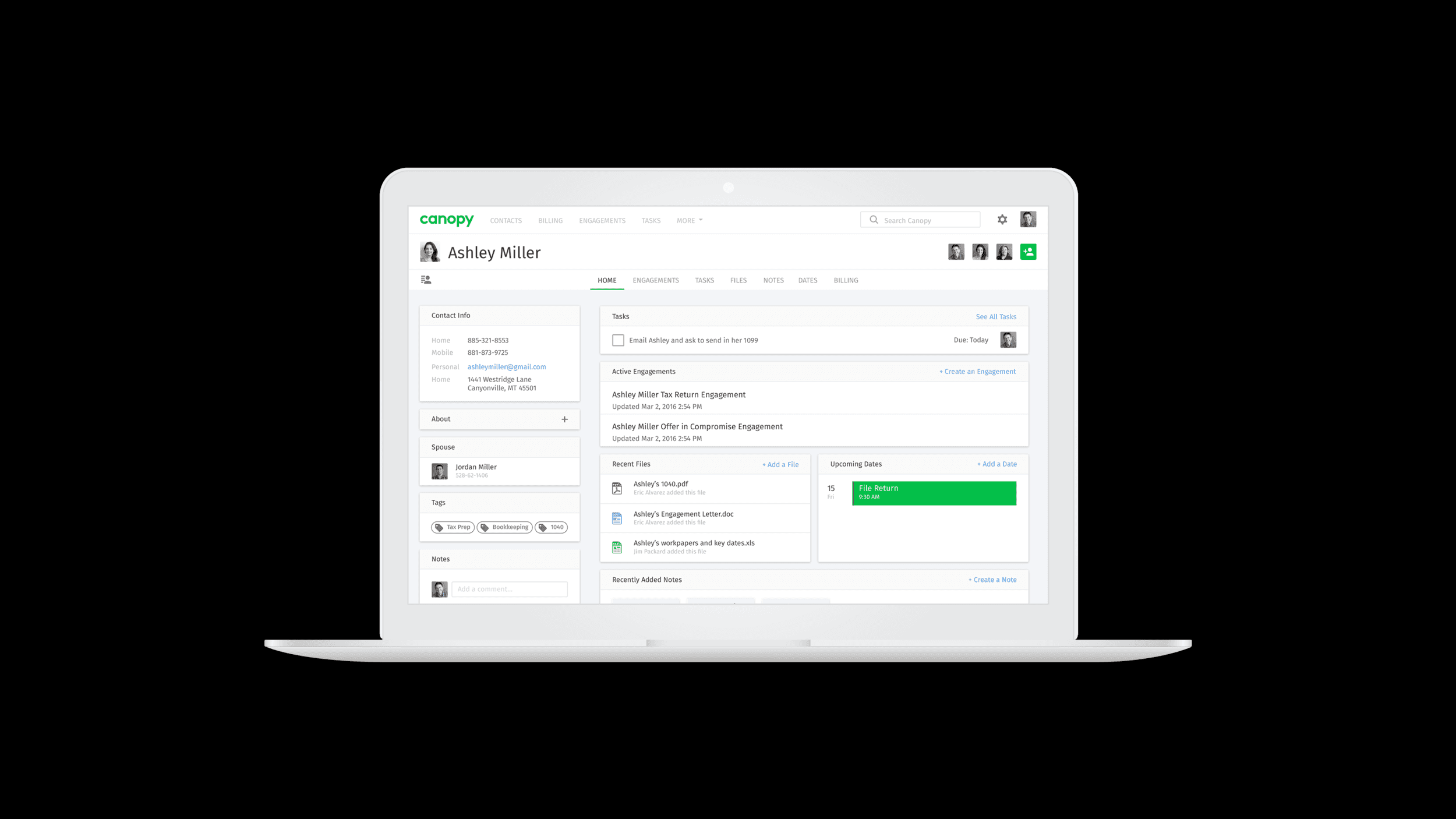
Canopy tax is professional tax software for the modern accounting practice. It offers tools for practice management, tax resolution, tax preparation and more all in one place.
Product designer, product manager, two front end developers, one back end developer, and 1 quality assurance tester
6 weeks
Taxes
The User Problem
After years of collecting data, there was not an easy way for users to mine that data to know and understand their customers accurately or take necessary actions.
Goals and Objectives
The original motivation was a feature request to add the ability to search and filter our existing contact list in order to provide a list of people that were assigned to specific employees of the firm. This would help communicate each employees work load and provide the means to assign and reassign clients.
Process
Kickoff: Having the developers involved from the first meeting was a great way to start the project and proved to be crucial for us to succeed. This meeting led to a secondary development problem that needed to also be dealt with. During this initial kickoff we outlined our six-week schedule and planned out our first week together as a team so that we all knew what each of us was going to be working on.
Development Problem: The developers and QA surfaced an additional problem during kickoff that the contact list architecture was aging and fragile to work with. This proved to prevent most developers from wanting to work in it and brought on major concern for adding features to it without creating more bugs which could quickly make it impossible to meet our deadline or provide any user value until the end of our deadline.
Research: After kick off we decided to spend our first week researching. Development researched quick ways to provide a fast, secure, and stable foundation to build from and the product manager and myself focused on user interviews, competitive analysis, surveys and more to develop a hypothesis.
“ Every time my manager asks me to get information from Canopy I cringe because it always feels so overwhelming. I have to navigate to a ton a pages and then I end up creating a spreadsheet to synthesis all the information. ”

Nick Reynolds
Administrative Assistant at TaxPros
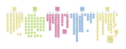
Empathize: We needed to find out who we were designing for and get to know them. To find out what they do, say, think and feel about we came up with some assumptions. We sat in on calls with our customer success team, met people in person, and sent out surveys. By doing this we hoped to gain empathy for our user. I organized the data from the surveys and interviews into an affinity map. This helped show a more complete picture of the data and common points to focus on improvement. This along with the personal info from our surveys helped us come up with a persona for the project so that we could better target our solutions.
Key Findings:
• There were 3 additional lists of people that users wanted.
1. Employee assignment lists (original feature request)
Birthdays
New customers
Most valuable customers
• Save and share lists. Often times the person responsible for creating the list isn’t the person that needs to see the list.
• Dashboard metric view for saved lists. Most of the time the person requesting a list was more interested with the total number of contacts in the list than the actual contacts themselves.
• Taking action on the lists. Sending emails, adding tasks, and assigning and un-assigning employees were the most requested actions.
• Our customers are most familiar with working within spreadsheets and are using them to create their own columns for reporting. We must be able to add a report view to their list in order to view other related information such as contact information.
Hypothesis: To meet the immediate pain customers are feeling, we can provide the ability for all Canopy users to view the total number of contacts and take action for the top requested lists. Then we will follow with the ability to build lists from scratch and edit existing lists.
Feature Definition: After understanding the task, our product manager and I created a roadmap to help break the features down into deliverable increments which consisted of two major chucks of work — minimum viable product and a larger second release phase. We estimated that phase 2 would take an additional two weeks but would also provide other teams with good clean data from the CRM to work with. The entire product team was in support for adding the two additional weeks.
Ideate: Using everything we had learned, I began to create simple wireframes of ideas. Through this process I was able to work with designers from other areas of the company to quickly validate ideas and discover related interfaces or flows that already existed.
Prototype and test: By utilizing Sketch, InVision, and Maze to create some high fidelity mockups that we could test and measure, we were able to accomplish quite a bit of our project including:
• Testing if our hypothesis would help solve the problem.
• Seeing how users would react to the proposed solution (were they excited or underwhelmed).
• Handoff design to the developers to show them the layout and user flow and estimate build time.
• Quickly gather feedback and A/B test different options for quick iteration.
Discoveries: We went through multiple iterations of design. We found that the following areas needed more thought and attention:
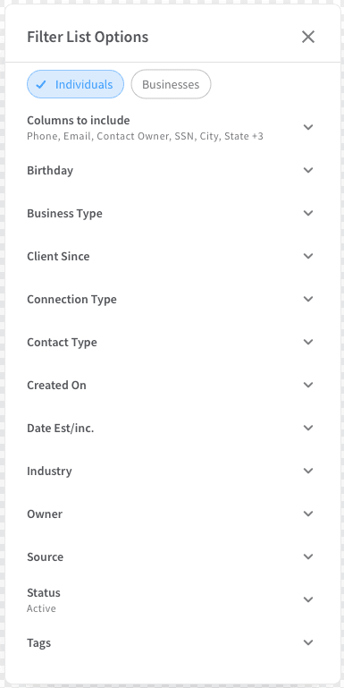
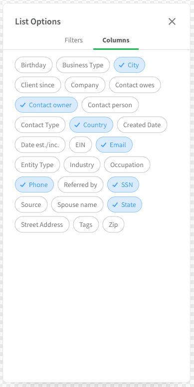
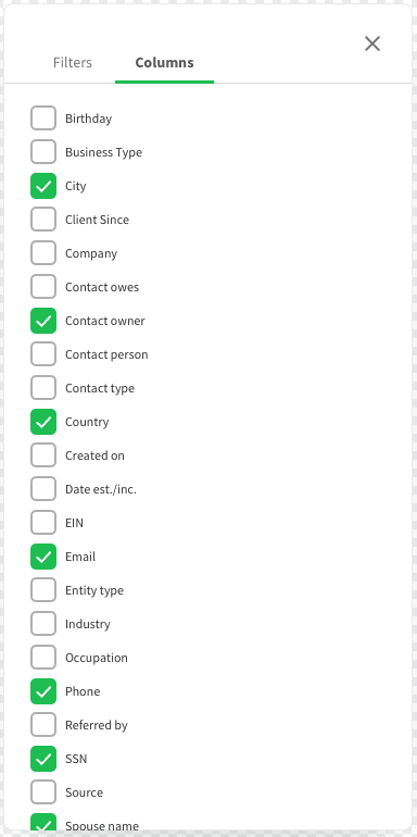
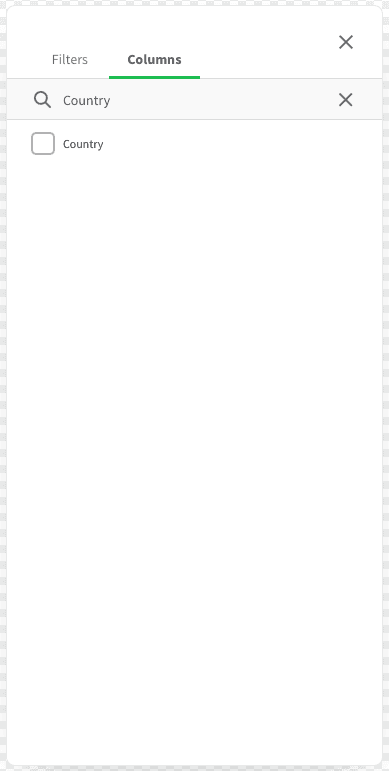
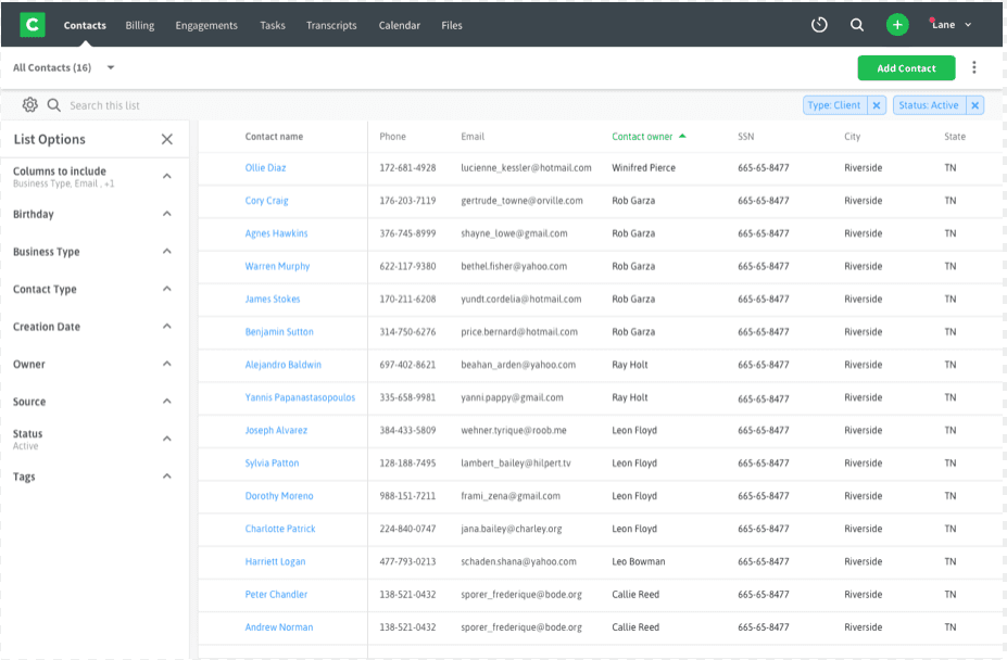
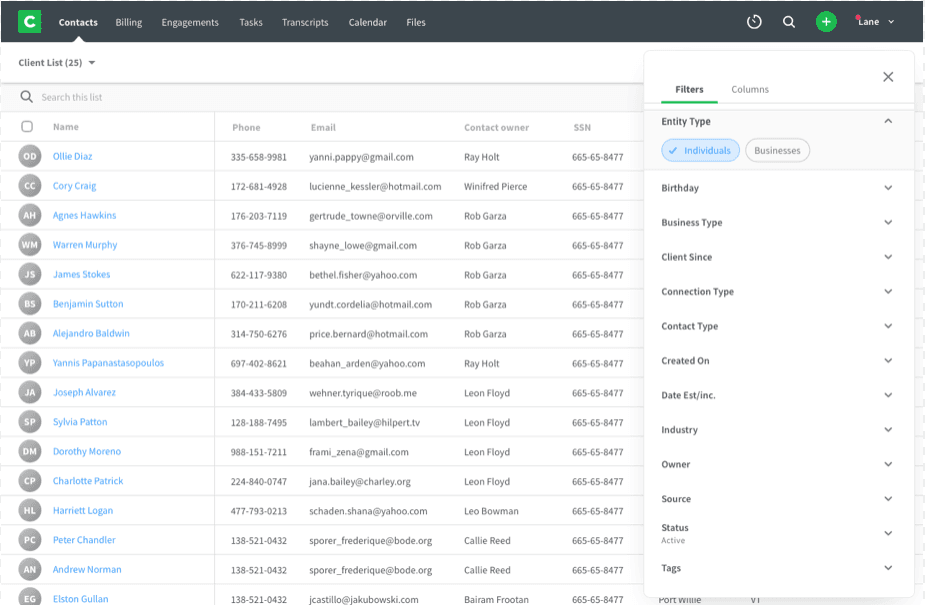
• The display and location of column options.
Combining column settings with a filter list proved to create confusion and slowed the workflow.
The use of choice chips seemed to slow down the scan-ability of the options.
Using checkboxes in alphabetical order seemed to help but the list was long.
We settled on checkboxes but added a search field to help easily find the option you were looking for.
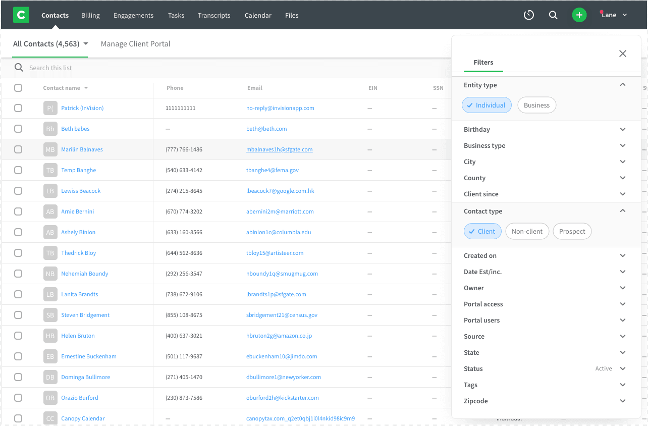
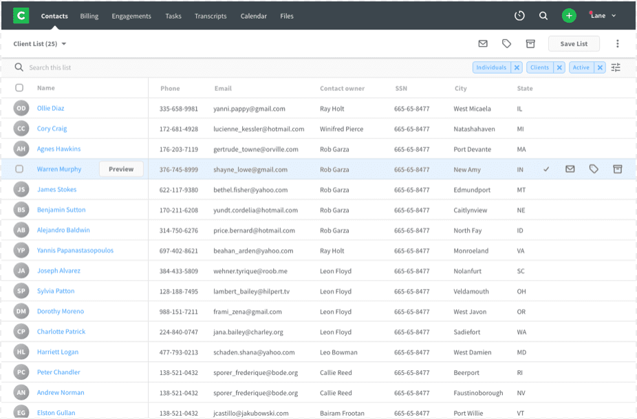
• Where the filters would live on the screen. We discovered that once lists were created they wouldn’t really edit or create new ones so we decided to make it an excusable interface so it didn’t interfere with daily work needs and flows.
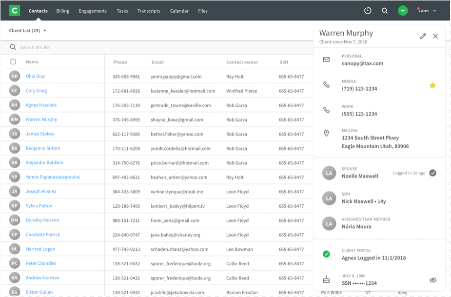
• We also tested some ‘nice to haves’ that we heard during our research such as a contact view on the list page, a relationship view, and a responsive view.
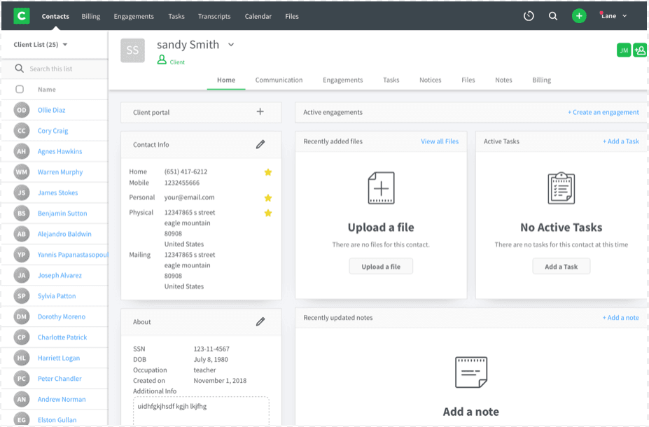
With this option we tested a brief contact view with some important information However it did not seem to meet our users needs.
In this iteration we tested the ability to see the entire contact page and people absolutely loved it.
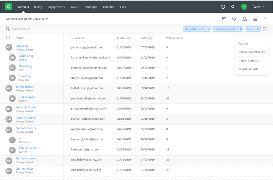
A huge discovery we made was that our users considered the entire family as the client not just individuals in the family. This lead to us testing out this family view.
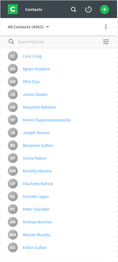
This was the simple mock up for the responsive view.
Conclusion
While I’m no longer assigned to this project, I’m confident in a successful outcome. By doing some simple homework before creating designs or writing code, we were able to discover the heart of the problem as well as other problems that will need to be solved in the future. The measurables of usability, speed and even delight were off the chart based on the prototypes, so I’m confident that if the final product tests half as good as the prototype, our team will have successfully solved a customer pain that should affect the entire company. We held daily stand-ups to communicate goals and also met at the end of each week to recap with the team what we had accomplished. Working in an agile environment and continually communicating about the project was essential for us to successfully meet our deadline.
9/10
User Satisfaction
60%
Less time
84%
Increase in time spent on website
