Responsive Overhaul
Church Community Builder provides software for churches of all sizes and their mission it to help churches encourage and measure engagement through attendance, serving, and financial giving. One of my primary roles this last year was to help with the adoption of a new architecture built with React while also creating a new responsive design system based on Googles Material Design language. The products that needed the most attention struggled to scale alongside the hyper-growth of the company. Fundamental usability was challenged. Product reliability and performance issues increased exponentially. Below is a brief overview of the responsive overhaul process.
Challenge
Our goal for the project was to recapture the ability for anyone to host an event without needing comprehensive training or documentation to do so. The original premise was simple: create an event, invite people, and take attendance, but as time passed, new functionality and an aging interface made it frustrating for our users. However, we weren't trying to revert to a simple past. Our ambitions were to create a strong foundation that stood apart from the competition while providing everything needed by a more diverse user base.
Goals
• Make it fast and easy to use for everyone, everywhere, and on any device.
• Build reusable components using react and based on Googles Material design system.
• Create a platform for innovation and deeper engagement.
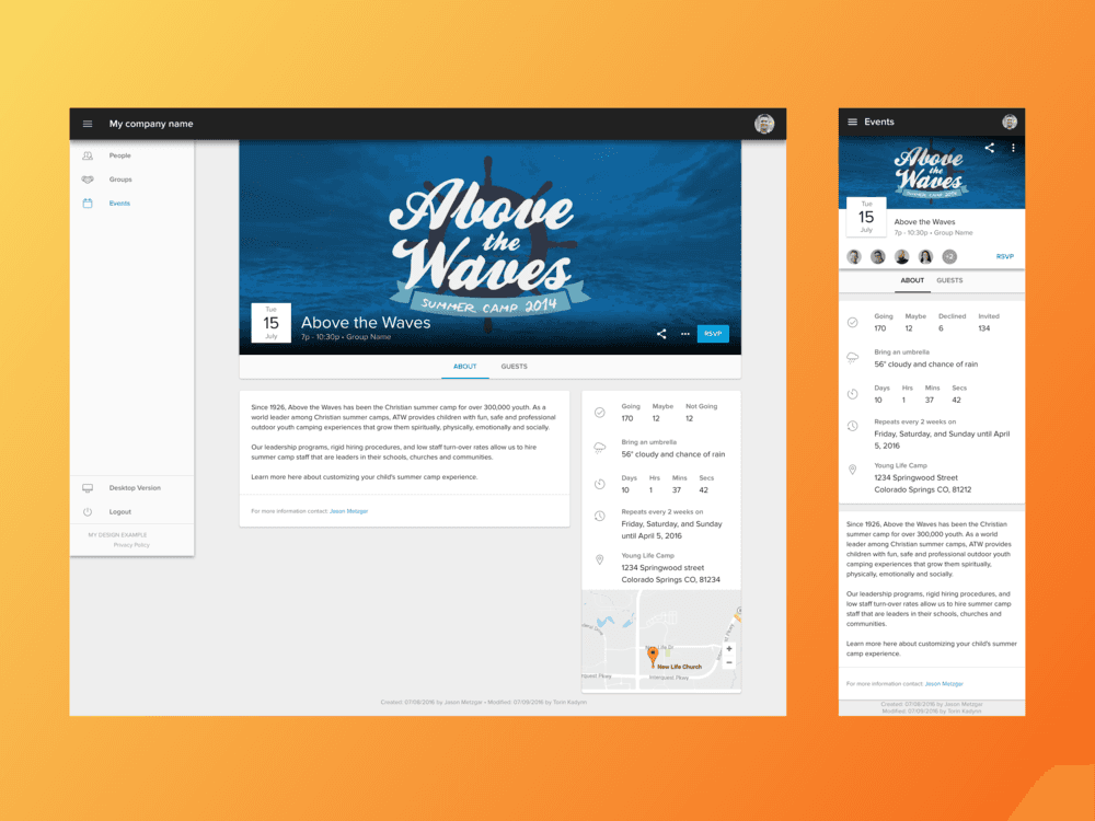
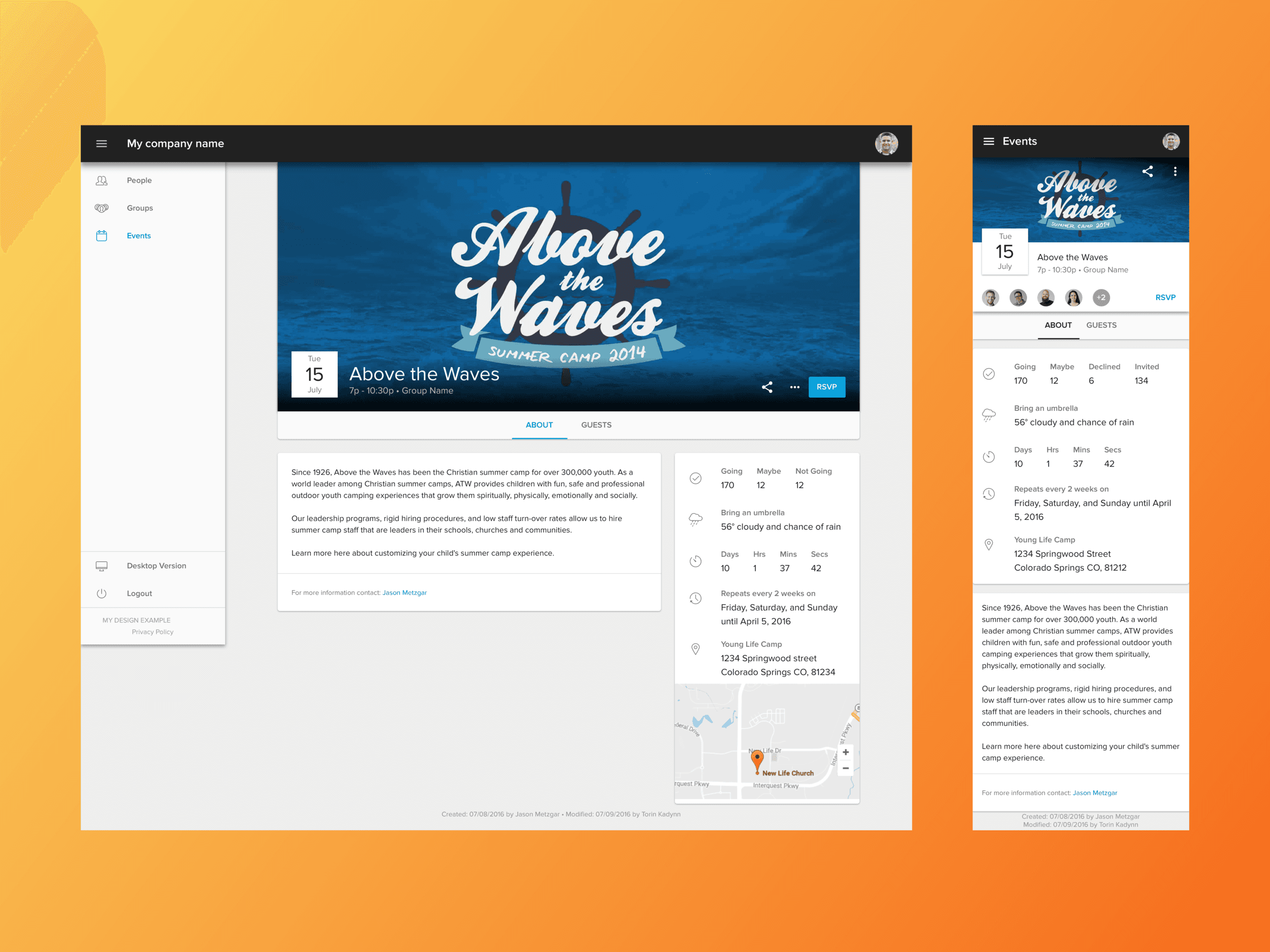
Above is an example of the Event Detail Page which needed to include: Title, event image, description, contact information, time of the event, location, countdown to event, weather snapshot, guest list, recurrence pattern, and the ability to share and edit the event. We also included a footer that displayed the created and modified dates as well as who took the action. This was our MVP and we have since added more features like room and resource booking.
Above is an example of a mobile schedule list view that I created using Principle to communicate to developers some of the interactions such as the sticky date headers and parallax image Breaks for new Months.
Process
My first role was to create our new design system which would support us in building our first prototypes. Through collaboration with Project Managers and Product Owners conducting research and user testing with our existing product, I was able to take the results, wireframes and mockups we had, to build our first Prototype using InVision. After testing many different iterations, we took what we learned our 'jobs to be done' were and quickly built and released our beta version. I followed and supported this project from idea to final release.
This events tool has since proven to be one of the most utilized products the company currently offers. The company also offers an excellent Forms tool however after releasing our Events work to beta, our forms user interface really stuck out as being outdated and lacked the responsiveness of the events themselves. We quickly prioritized an overhaul of Forms tool.
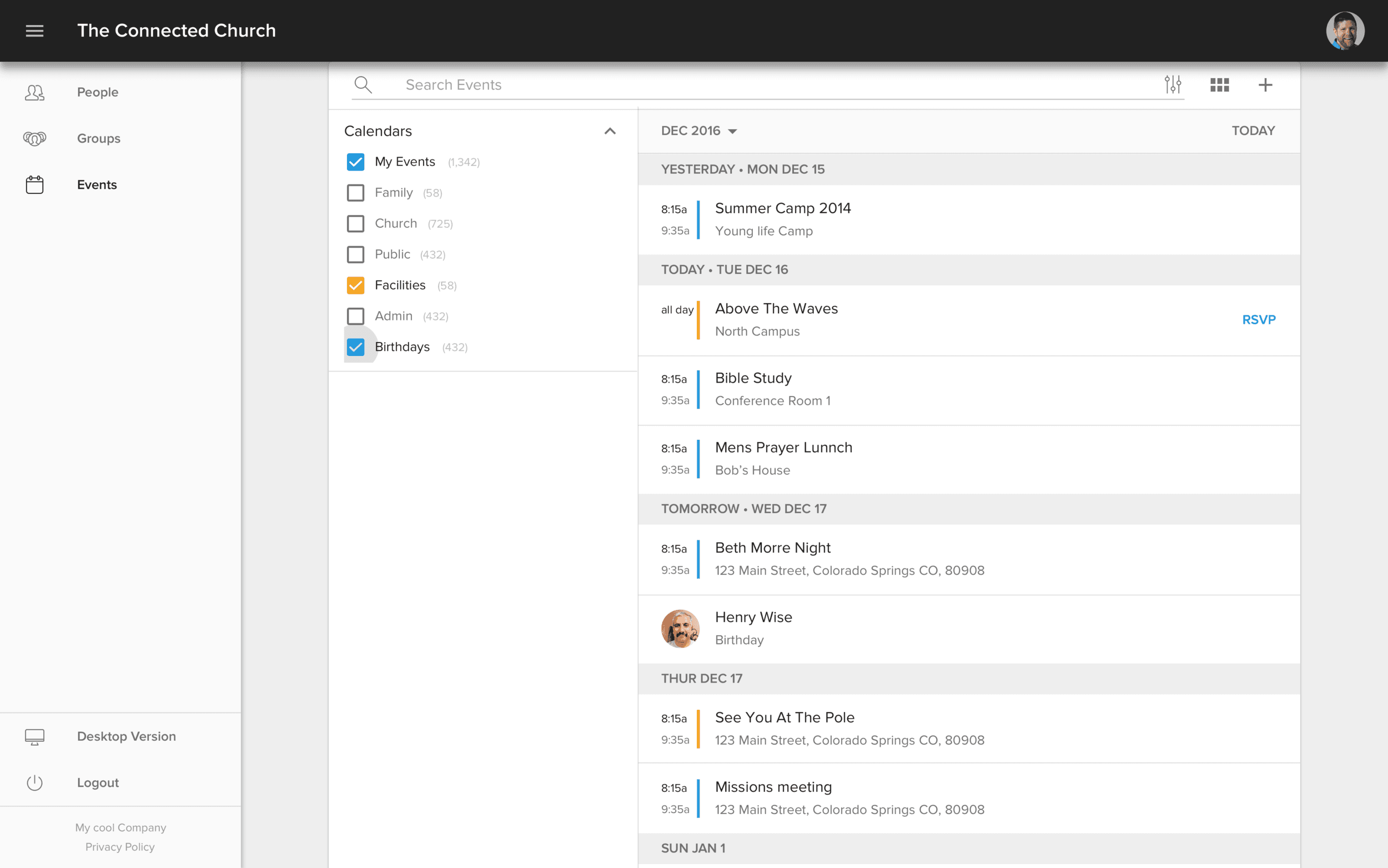
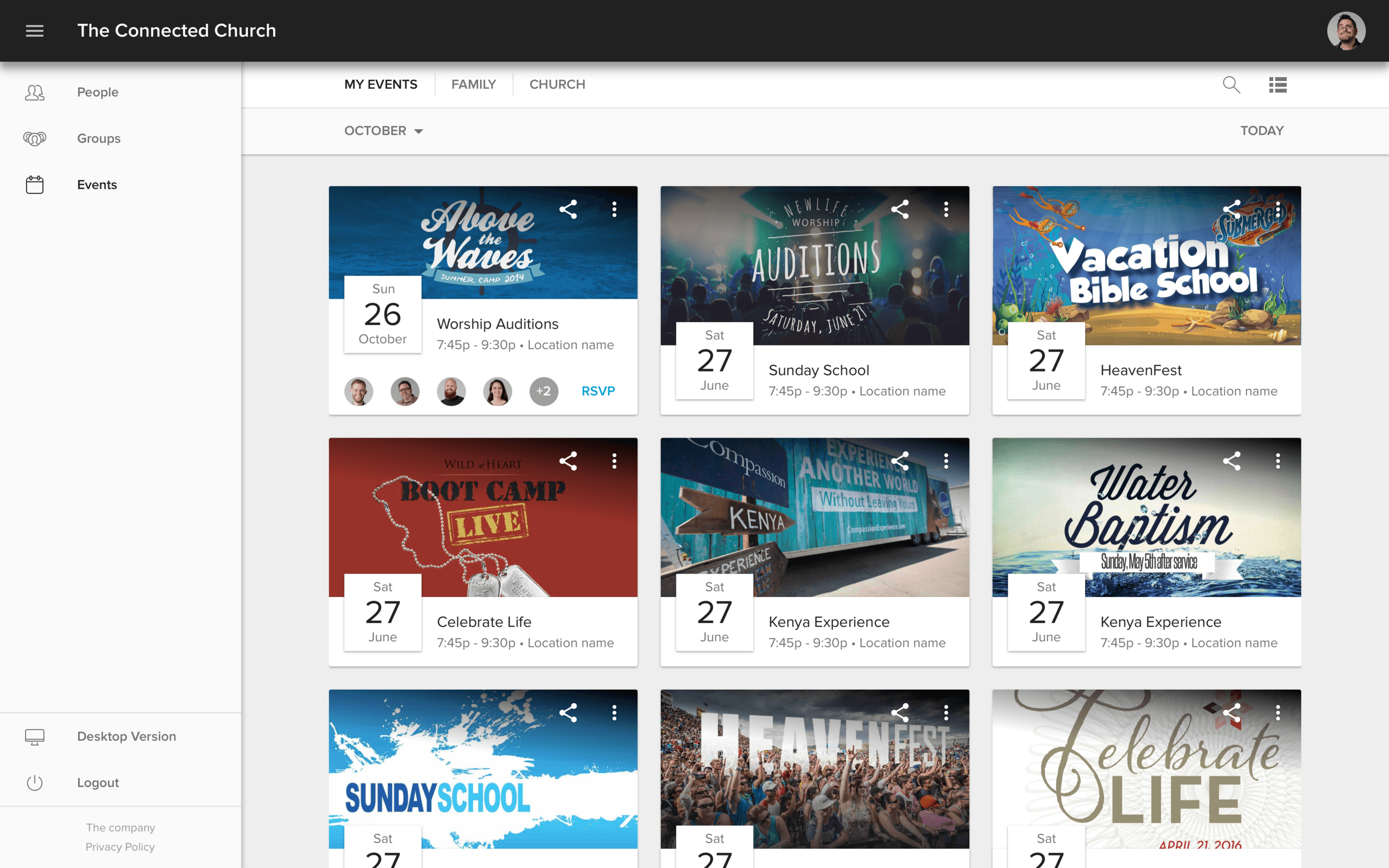
Above you will see two examples of the same page. One is a list view and one is a grid view designed to make discovery of new events easy and intuitive. We also included images of friends and family going to each event to help ENCOURAGE participation
'Groups' Challenge
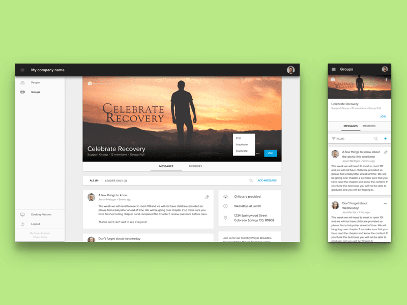
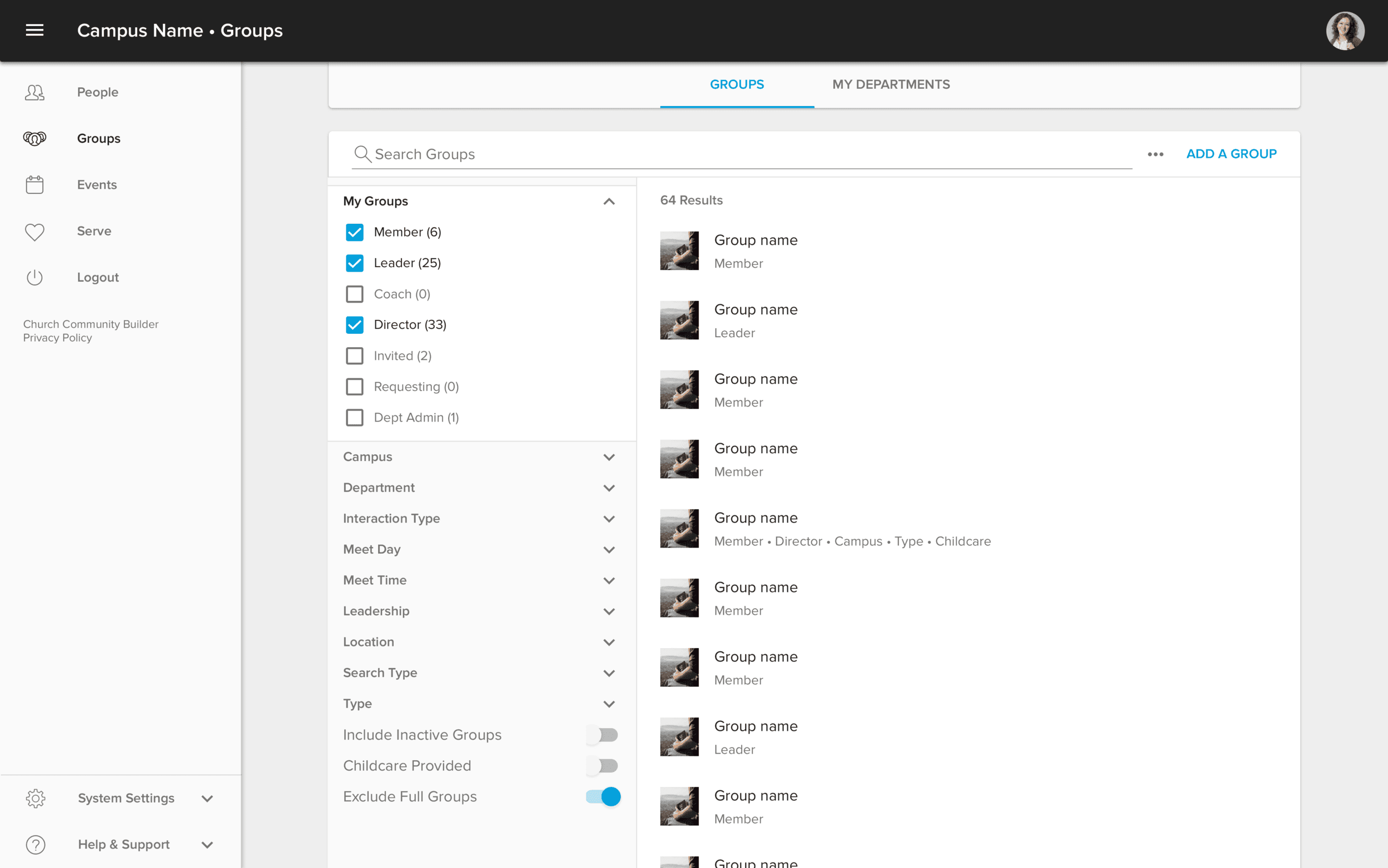
Groups are a tool to help the church and those in the church engage with people that have a shared interest or purpose. One of the first things you will notice is how familiar the structure of our Groups page is to the Events pages. This was a strategic decision that enabled us to build fast using the existing components from the events project. I partnered with project management to uncover insights and translate concepts into features that addressed customer behaviors and motivations. Something we discovered quickly in our research phase was that that there were two personas that we had to consider when building a group, those that were looking for groups and those that wanted to engage with their group. For people looking to discover new groups, things like images, details, and descriptions were very important. However if you were already participating in a group that information was repetitive and in the way. So we designed the group detail page to highlight the group information if you weren't already a member and then tucked it over to the right side and highlighted messages if you were a member.
'Profiles' Challenge
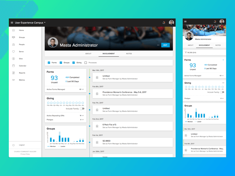
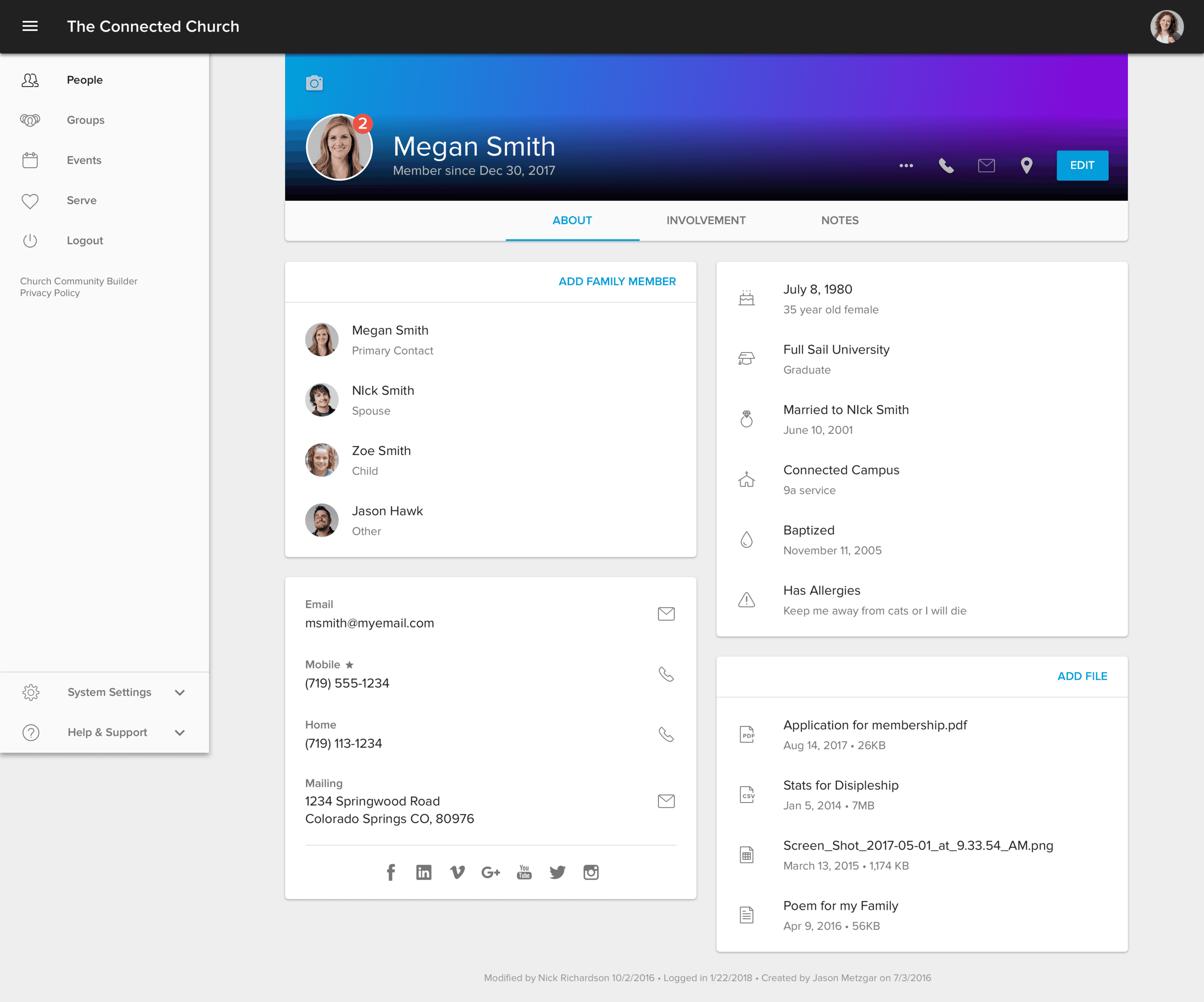
This project included the overhaul of our advanced people search directory and profile pages. The profiles were used by multiple personas such as administrators who were most interested in the details, church leaders that really only wanted to see a high level view of involvement, and church members looking to contact and get to know those they attend church with.
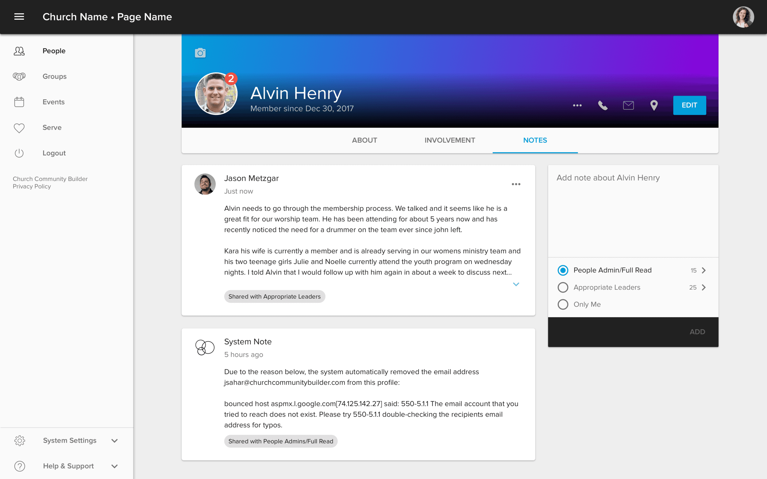
Profiles are one of the most important areas of the software and have the greatest number of page views and customer interaction. While completely redesigning profiles to be easily understood and accessible was needed, we really had to consider how disruptive it could be to completely change a page people were already so familiar with. By utilizing the existing frameworks from Events and Groups, I was able to quickly create prototypes to share the vision, gain alignment and drive decision making. We discovered that our changes were not only well received by all three personas but there seemed to be an overall excitement for the future direction of the software.
Highlights from the project:
• Simplified profiles from having 25+ pages to 3 which included an about page to communicate who the person was, notes section to give leaders the ability to view and share vital information about people so leaders can provide the best level of care, and an involvement section that contained both high level metrics and detailed information which measured individuals financial giving, serving, and attendance.
• We found that profile information wasn't only needed from a profile page so we introduced a new quick look feature that could be accessed from any page. We were able to utilize the design of a profile for the smallest screen we supported, and make it accessible from any page of the software. For example you could quickly view information about someone in a group you are leading without ever having to leave the group context.
• We made it easy for people to find other groups of people in the church by building a comprehensive picture directory that included a filter design that felt familiar and safe.
