Dynamic Icons
I created these micro-interactions to help reinforce our user experience and provide delight. When done well, they can help guide someone through an application while providing feedback and making the application much more memorable.
Accordion: I found that the complexity of our software required more accordions then maybe normal. So I thought since people would be tapping this particular icon button so often, it would be a nice touch to add some animation to it.
Advanced Filter: A problem that surfaced was how complex and unintuitive many pages started to become since there was so many different actions and settings available. We discovered through user testing and research that most people didn't use the majority of our features but removing them would be too disruptive. So we decided to hide many of the advanced features that only power users needed behind this icon. We wanted the icon to be obvious and maybe even fun to interact with to help ease the change.
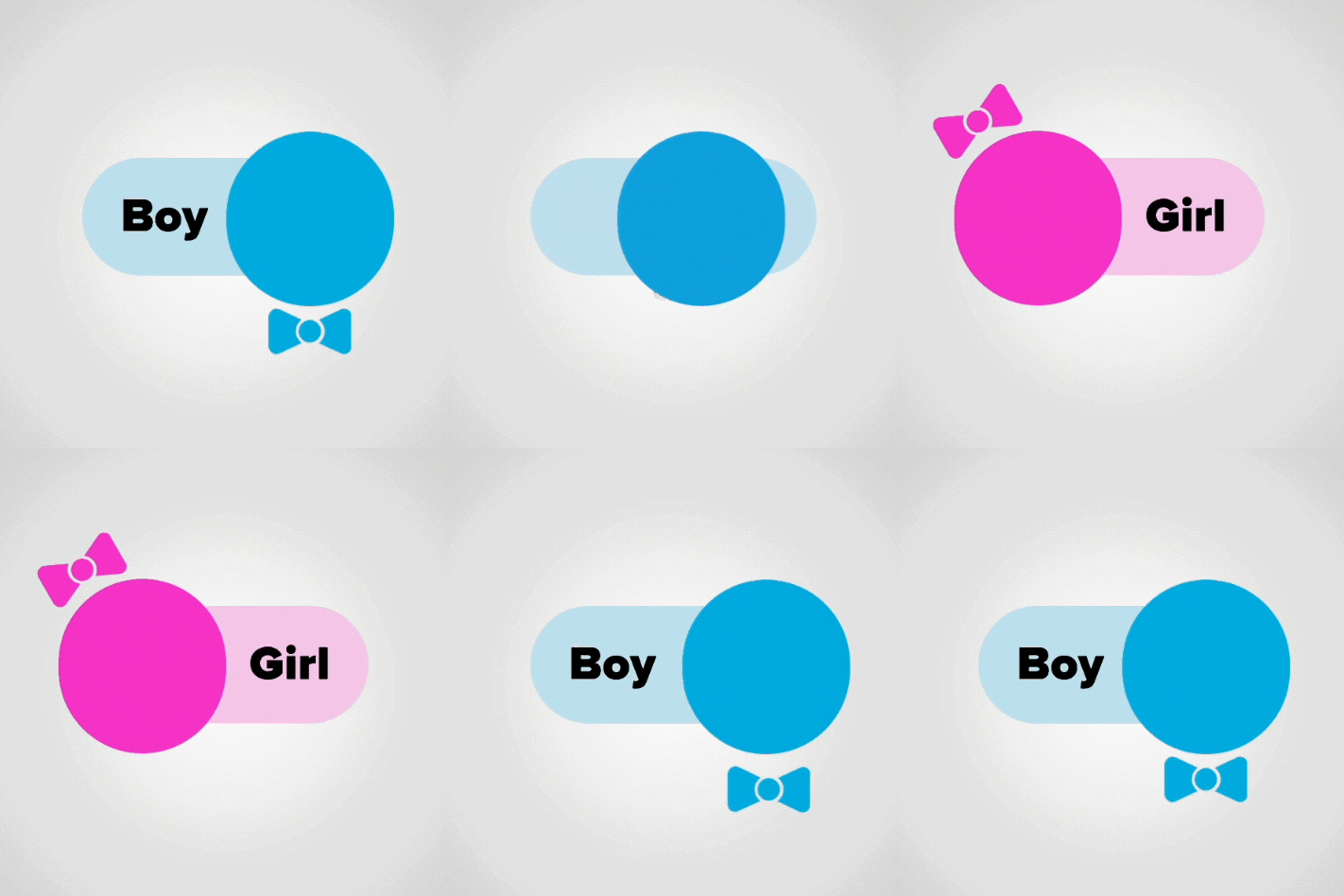
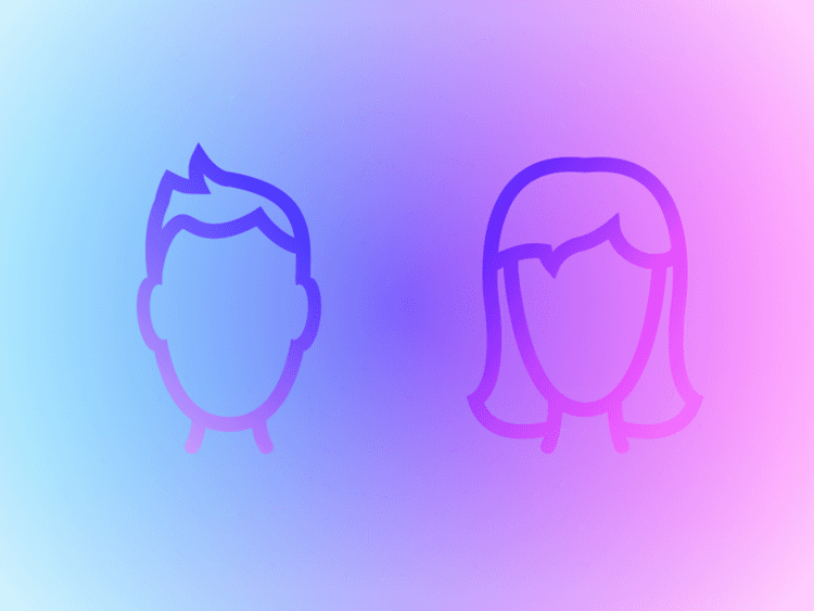
Gender: Many of our profile edit fields were dropdown fields and we found that it truly felt like a chore to get either administrators or profile owners to update their profile. This was an experiment to see if we could make it easier for people to fill out their profile while also providing some fun.
Other Icon Work
The purpose of this introduction is to intentionally reveal functionality to potential runners while also building some excitement. This was one of my first projects using Principle and I used it as an opportunity to explore the horizontal swipe animation and color transitions.


